UX Design for a Mobile Application
Project Overview
To highlight hidden stories in a small history museum exhibit, I designed a mobile application that would host audio stories featuring prominent local historical figures. I used a content-first approach to reach my final design, along with low-fidelity wireframing, paper prototyping, high-fidelity prototyping, and A/B testing.
Project
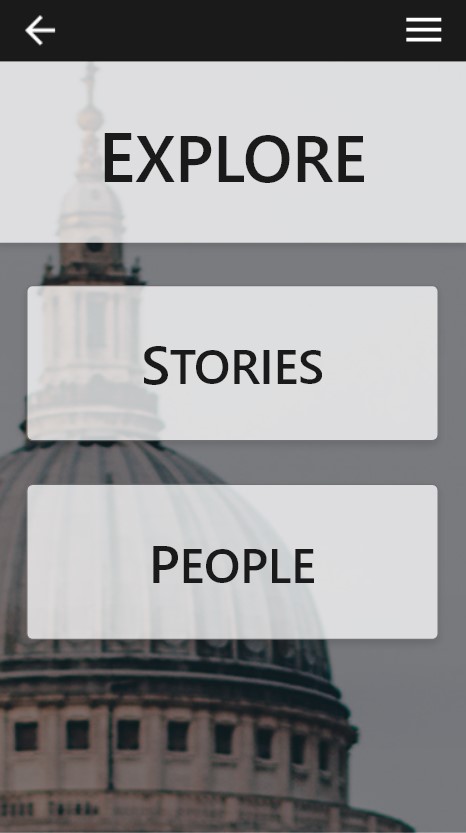
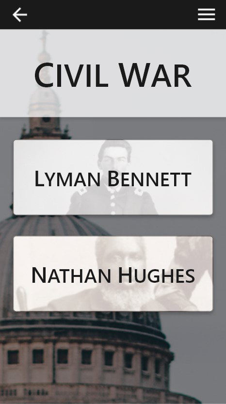
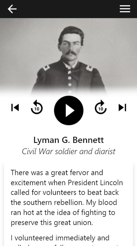
A mobile application entitled In Their Own Words that I designed to make audio stories available to visitors of a cultural history museum. These audio stories feature first-person narratives based on biographical facts.
Challenge
Highlight overlooked stories about interesting historical figures found in a few key exhibits in the museum’s gallery
Timeline
January – May 2018
Design Process
Research
Background research for this project included analyzing current commercial solutions (like Google Play and Amazon Music) and available competitor solutions (like mobile applications developed for the Spencer Museum of Art and the Smithsonian Institution’s National Museum of African American History & Culture).
Personas


Using primarily empirical information, I created eight general profiles of various visitor archetypes. I made these profiles specific to the client. From these eight profiles, I created four individual user personas – two who would find value in this application and two who would never download it. From these, I chose one user to reference as I worked through the design process.
Information Architecture


I knew who I wanted to design this application for and what I wanted to include, but how would it all come together? Using basic information architecture principles, I created a structure for the application that helped to guide me when I began designing and developing the audio stories that I wanted to include.
Questions I asked myself as I built the basic architecture: What content will people expect to see first? How will they find this content? Where should it be placed in relation to other information? How will they navigate between the stories?
Wire Frames


I experimented with wireframe.cc to design several layouts for this application. I chose a final working design by conducting simple A/B testing with two potential users.
Mock Ups
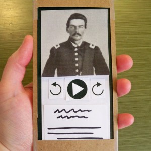
I started with a low-fidelity mock up to experiment with a few designs using nothing but paper, markers, and cardboard. From there, I created a higher fidelity mock up using HTML and CSS elements to see the application’s structure and architecture in use. I moved on to designing individual screens using Adobe Photoshop and connecting them using Invision.
Issues
I caught myself sweating the details while designing and building out the final version of this application. I should have kept the bigger picture in mind and focused less on whether the shadows behind some elements were too soft or too harsh. Also, I spent too much time seeking a technical solution for an element in the design that was not important.
Other Versions
A sample of the many iterations I designed before the final version:


